Visualizing Data Poisoning With Networks
Background
More and more software applications and APIs have started integrating some flavor of machine learning into their workflow or technology stack to the point where almost everyone is integrating it into their software products. This growth is likely attributed to several factors but the one that stands out is hype. As a result, ML vulnerabilities have become more significant in the present. This has proven to be beyond the typical hype cycle trend which has been great for those looking to exploit additional interesting vulnerabilities.
Last year, I was fortunate to attend a ML vulnerability workshop at DEFCON, which inspired my research specifically into data poisoning. Data poisoning is a unique vulnerability, as it is not directly tied to the process of machine learning and training models, it is poisoning the training data itself before it is integrated into training the model. Specifically, as defined by OWASP, data poisoning is an “attack [that] occurs when an attacker manipulates training data to cause the model to behave in an undesirable way.” Data poisoning occurs by altering data by three methods: addition, modification, or deletion of data. In the workshop itself, we proved that data poisoning in a large dataset is not noticeable in the model itself until high amounts of it are poisoned using Jupyter notebooks, which are fantastic for testing machine learning vulnerabilities in small batches.
Since data poisoning is directly related to training data, I believe that showing the concept of data provenance, or the history of dataset changes over time, is a great way to detect data poisoning within a dataset. Data is also easily integrated into networks. In this context, networks are graphs or mathematical structures describing systems of nodes/vertices and edges/links, which I use interchangeably. Various systems can be defined by networks, such as the World Wide Web, the nervous system, and even flavor components of food. Behind every complex system is a network that defines interactions between its components.
Networks are powerful tools for prediction but are only as accurate and stable as their data sources. Paths, or a sequence of nodes connected to one another by edges, allow us to make predictions or implications about the underlying data. I chose networks as a representative visualization tool since they provide an avenue for context through being able to display relationships through their nodes and edges. Networks are intuitive for the human eye to process. Parts of my research was actually inspired by Bloodhound, a graphical tool representing domain networks. When network penetration testing, I love using this tool since it provides a strong data and visual aid into understanding relationships in active directory.
Analysis of networks also leads us to some interesting statistics, such as edge multiplicity, or multiple edges sharing the same nodes. Edge multiplicity represents the intensity of certain connections within a network, which can be visually shown with thicker lines stretching between nodes. Conversely, sparser lines mean less edges between nodes.
Security Implications
Training data can be manipulated through attack vectors. For example, private datasets can be infiltrated through insider threats or sophisticated attacks and public datasets or repositories are prone to data injection attacks. With public datasets, poisoned data can proliferate into other models and applications that rely on these public datasets and technologies.
Data Poisoning
My journey into data poisoning networks began with a poisonous Python script. This script poisoned one’s choice of nodes or edges or both in a spreadsheet. Also, there is an option of how significantly you would like the script to poison your chosen network. Gephi was then used to display poisoning results. Gephi is a network visualization and analysis tool used as a desktop application. To use it, one can upload a spreadsheet with nodes and a corresponding sheet with edges. It is also possible to build your own network by adding nodes and edges, and customizing its appearance. It is also open-source and includes many different algorithms that help visualize different types of information. Gephi runs network analysis calculations that provide metrics such as degree distribution and modularity. Since you can also run multiple tabs in a single workspace, Gephi provides an easy way to compare healthy and tampered data in the same workspace.
Case Study I: Les Misérables Character Network
To explore data poisoning within networks, I borrowed the Les Misérables network, created by Donald Knuth. There are two main reasons why I chose the Les Misérables network specifically: it is the default network cited as an example in many college courses teaching network science and it is also a network that is intuitive to digest as many of us are familiar and able to imagine social networks and the relationships between people.
The context of this is a story so we can see the direct result of poisoning this network. In this network, nodes are characters in Les Misérables by Victor Hugo and links represent the co-occurrence between two characters. There are 77 nodes and, in the default network, there are 254 links.
To poison this network, I used the network poisoning script to add or delete edges between characters, either creating additional interactions that do not exist, or deleting several significant interactions that would theoretically change the outcome of the story.
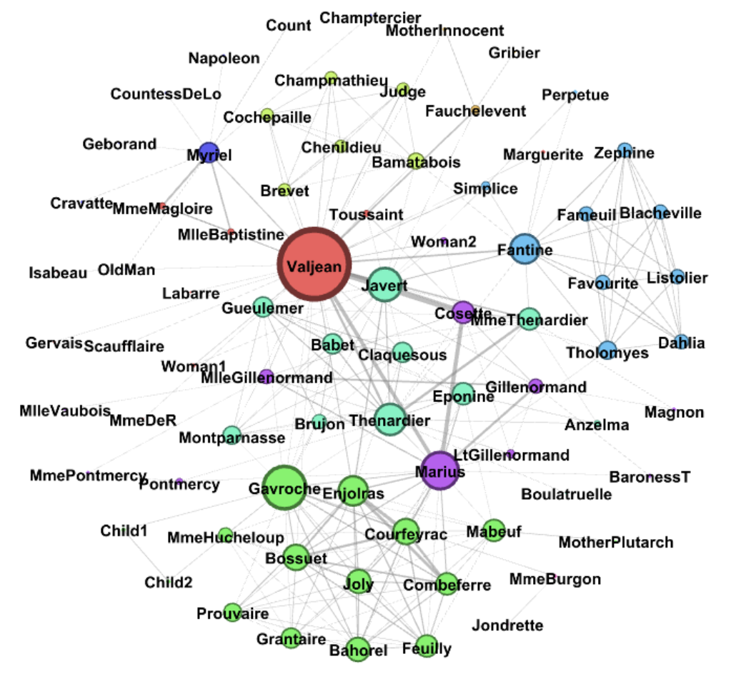 Initial Graph (before modifying)
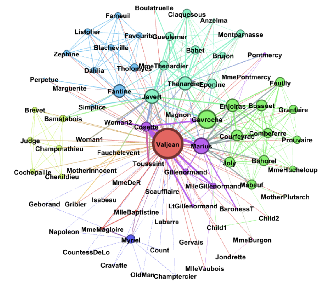 Adding edges that create interactions between characters that did not exist at all in the first place.
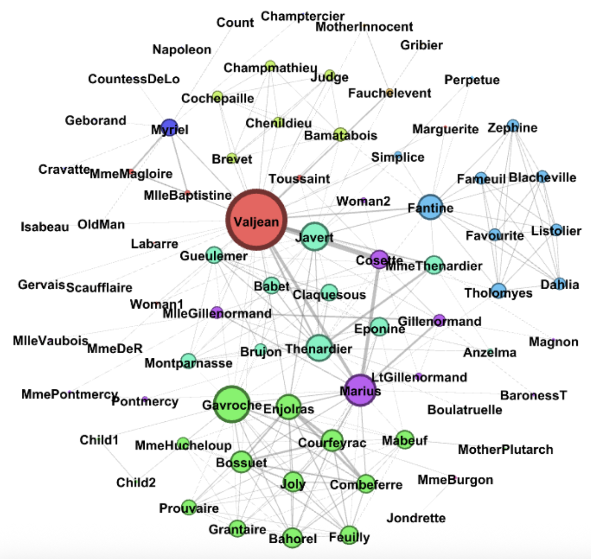 By removing/deleting edges, we can delete important interactions in the data
I wanted to use this case study as an example of something tangible that can change when an attacker modifies or poisons data in any way. The degree, which again is the number of edges connected to a single node, is less and as a result, the nodes or characters in this case have limited connectivity. The average degree, as a result, is decreased, and so the network is less dense, characters are more isolated and as a final result, less developed.
By removing/deleting edges, we can delete important interactions in the data
I wanted to use this case study as an example of something tangible that can change when an attacker modifies or poisons data in any way. The degree, which again is the number of edges connected to a single node, is less and as a result, the nodes or characters in this case have limited connectivity. The average degree, as a result, is decreased, and so the network is less dense, characters are more isolated and as a final result, less developed.
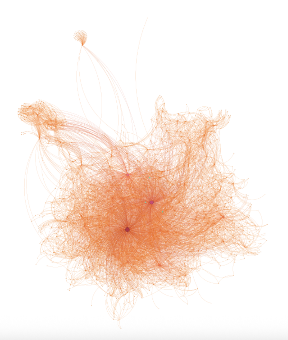
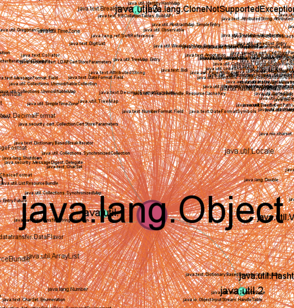
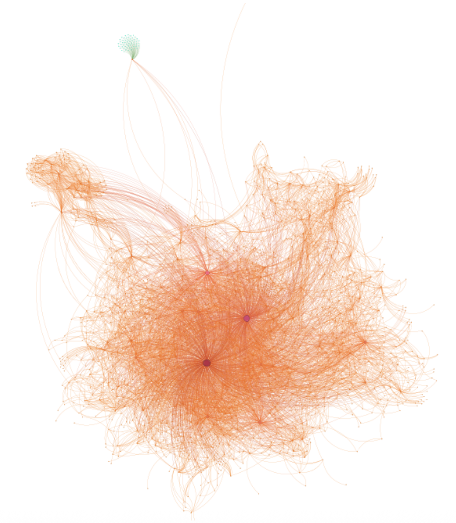
Case Study II: Java JDK Package Dependencies
In another more technical case study, I explored poisoning nodes in a network of Java JDK package dependencies. This network contains 1538 nodes, Java packages in this case, and 8032 edges that indicate dependencies between packages. By adding nodes, we can add packages that do not exist.
Adding nodes is simple in this case; however, adding connections between the additional nodes and existing nodes is better as from the attacker’s point of view, connecting to nodes with more edges makes detection more difficult. My network poisoning script would add a single node to a node with multiple connections before adding nodes that were all attached to the originally injected node in order to create a dependency cluster.
 Initial graph, note the dependency cluster at the top left
 Initially, I did a tiny modification that would be nearly impossible to see. The added nodes are highlighted with green.
 Closer look with labels, the added nodes and edges are in green.
The script also modified existing nodes with a simple labeling poison by simply modifying the label of the nodes within Gephi. As a result, an attacker could use this modification technique as an opportunity to include dependencies on malicious packages, for example.
Closer look with labels, the added nodes and edges are in green.
The script also modified existing nodes with a simple labeling poison by simply modifying the label of the nodes within Gephi. As a result, an attacker could use this modification technique as an opportunity to include dependencies on malicious packages, for example.
 Here I modified the dependency cluster to be green to demonstrate modification. For java dependency groups, it could be assigning their values to null or just having false lines of code.
Conclusion
Through my case studies, I wanted to demonstrate the differences between healthy data and poisoned data. By visualizing mathematical differences via graphs, we can prove that data has been altered in some way. In addition, we can detect data poisoning by labeling the data that we use.
Reflection
After presenting my research at several conferences, I received a lot of fantastic feedback and commentary, some of which included potential ideas for future work. For example, it would be interesting to apply criticality to data poisoning. How critical is the poisoning in relation to the total amount of data and how can we label the extent of the poison? This also ties into the idea that a little bit of poisoning in LLMs is usually undetectable in the training cycle; however, the poison has a significant ramp up over progressive poisoning. This would be interesting to observe further.